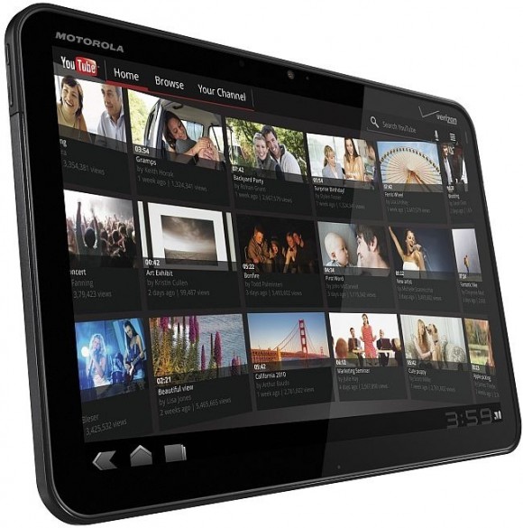

Motorola XOOM Features
Motorola XOOM Specs
You can find the complete specs of the Moto Xoom below. Some details might be missing and we would updating it as soon as we have have more info.
| Motorola XOOM Tablet | |
| OS | Android 3.0 Honeycomb |
| Differentiation | Larger display in smaller form-factor, 1080p HD support, first tablet with Honeycomb software, dual-core 1GHz processor, and a wide range of docking options |
| Dimensions | 249.1mm (h) x 167.8mm (w) x 12.9mm (d) |
| Display | 10.1” 1280×800 resolution |
| Weight | 730 g |
| Processor | NVIDIA® Tegra™ 2: 1GHz dual-core processor |
| Battery | Up to 10 hour video playback |
| Connectivity | 3.5mm, micro USB 2.0 HS, Corporate Sync, Wi-Fi 2.4GHz & 5GHz 802.11b/g/n, Bluetooth 2.1 + EDR + HID |
| Network | 3G, 4G LTE upgradeable, 802.11n w/Personal Hotspot |
| Messaging/Web/Apps | Email (Corporate Sync, Google Mail, POP3/IMAP embedded, Push Email, Yahoo Mail) , WebKit w/ Flash |
| Audio | AAC, AAC+, AMR NB, AMR WB, MP3, XMF |
| Video | 720p capture/1080p playback/streaming, H.263, H.264, MPEG4 |
| Camera | 5 MP rear-facing camera with dual LED flash/2MP front-facing camera |
| Memory | 32GB on board user memory, SD card support after software update, 1GB DDR2 RAM |
Motorola XOOM Test and Review
Five days into our magical journey of discovery with the Motorola Xoom, we’ve made the following three conclusions: (1) The web browsing and email functions of the Honeycomb OS are fantastic, (2) live Android widgets on a 1280x800, 10.1-inch touch screen are a revelation, and (3) people who complain about the Xoom’s weight and power button location either passed judgment too soon, or still haven’t overcome their iPad separation anxiety.
On our end, we’re still not quite ready to issue a final review verdict on the Xoom. That will come later this week, after we’ve had more time to dive into Motorola’s hardware, and (if all goes according to plan) compare it against the iPad 2. But for now we can share the following testing notes.
Web Browsing

Notice that the active browser tab is highlighted in a lighter shade of gray. Hitting the down arrow next to the Maximum PC label would bring back the browser's tool bar (which disappears when you scroll down a browser window).
The Xoom is essentially a Honeycomb reference design—insomuch that Motorola customized neither the desktop nor the core apps. So the tablet reveals Honeycomb in its purest, most undiluted form. And, boy howdy, Android 3.0 kicks ass in the tablet app we use the most.
Within just a few minutes of use, we were loving the browser’s tabbed windows, which allow you to see all your open URLs at a glance, just as you can with any modern desktop browser. Want another window? Open it, and it joins its mates at the top of the interface. Open another. And another! You can open up 16, and any that are obscured can be finger-swiped into view. Tabs are essential for a 10-inch browser window, and its ludicrous that the iPad makes you hit a vague, featureless button to see a grid arrangement of all your open browser window.
We also like the Honeycomb browser’s large, distinct refresh button, and its app-specific options menu, which, among other features, gives you quick links to a “Find On Page” search (a function that’s relatively clumsy on the iPad) and a “Share Page” feature with direct hooks into Facebook, Twitter, Gmail and Bluetooth. The browser itself seems pretty well-optimized: Page loads are quick, and page scrolling is faster and more responsive than on the iPad.
That said, The browser’s object-caching during loads unnerved us at first: When you hit a link, the app’s cool, laser-blue progress bar immediately progress about 10 to 15 percent – but nothing happens on the page. You wait, and wait, and -- BOOM! -- the entire page then loads, quickly, in one fell swoop. This contrasts greatly with iOS Safari, which loads more like a desktop browser -- i.e., a little at a time, drawing the page as objects are downloaded.
Is the Honeycomb way “bad” per se? No. It’s just different, and will probably alarm you for the first few hours of use.
The bigger Honeycomb browser faux pas comes in the lack of Flash support. The Xoom and other Honeycomb tablets won’t support Flash until Google bakes in Flash Player 10.2 sometime this year, hopefully before the end of Spring. But, jeez, even the Samsung Galaxy Tab includes Flash (version 10.1). Sure, it’s not an effective version of Flash on Android, but at least it’s present, and you can turn it on and off at whim.

Compared to any other phone or tablet mail app, the Honeycomb Gmail app offers a wealth of user options -- exposed right on the main interface. In this screenshot, the email message body font is set to "Huge."
The Android phone version of email was so unsatisfying, Samsung prettied it up and reformatted it for the 7-inch Galaxy Tab. No such triage is necessary for the Honeycomb version, however. Besides being fast and reactive, the Xoom’s email interface is purposefully simple, makes great use of the 10.1-inch screen format, and exposes important user options right where you can find them -- on the main screen itself.
When you first set up your mail account and download all your mail, you see a list of mailboxes on the far left, and a wider list of all your Inbox messages on the right. Tap a specific email message, and the left hand-column morphs from a mailboxes list to your Inbox message list. Simultaneously, the message you tapped expands to consume the broad chunk of real estate on the right two-thirds of the screen. In the contextual Setting options -- exposed right at the top of the mail app -- you can set message font size anywhere between “Tiny” and “Huge,” report a message as spam, or “mute” an annoying email thread that’s just dragging down your day. But these examples are really just the beginning of all the options that the mail app exposes right on the surface. Some people don’t like too many app options. But we see them as opportunities, and we appreciate that Android puts them front and center.
Widgets, Screens and Animations

In this shot of just a small portion of the Xoom's screen, we see widgets for the Honeycomb Calendar app, Analog Clock, WeatherBug and Twitter. Widgets run right on the home screen, pushing data in real-time, and all without having to launch an app.
With a 10.1-inch screen, and a luscious 1280x800 pixel grid, the Xoom offers generous pastures on which to graze your widgets. Sure, it’s a shame the Android developer community hasn’t yet created any super-sized widgets to take advantage of the new OS, but at least you can widget your way to your heart’s content across five home screens. Widgets are a huge feature advantage over iOS.
The 1280x800 widescreen aspect ratio also plays to the Xoom’s advantage. Compared to the iPad, it offers a decidedly larger, not-letterboxed viewing window when watching HD content. Overall, the screen isn’t as a bright and brilliant as either the iPad’s or the Galaxy Tab’s, and this is one area -- screen quality -- where we’ll probably see other “big screen” Honeycomb tablets trump the Xoom in short order. The screen errs toward a cooler color temperature, and its colors lack saturation and richness.

High-def, wide-aspect-ratio video not only plays without hesitation, it also appears in a larger window than on any other Android or iOS device currently available.
But at least RGB blue comes through bold and brilliant, and this is important for Honeycomb’s very subtle – but still quite sexy – interface animations. For example, when you reach the bottom of a list (say, in Android Market), and can’t scroll any further, a cloudy, blue “fog” will appear at the bottom of the interface element. And then there’s the blue laser progress bar in the browser, which we’ve already mentioned. Both effects are cool, and we hope to find more Honeycomb animations as we explore the OS and apps more thoroughly.

When you scroll to the bottom of a list and can't go any further, the top of the open window shows a hazy blue animation. It's subtle, yes, but we love these clever gesture cues.
The Physical Beast Itself
We’ll end this little progress report with some quick-hit observations about the hardware design, and all the experiential nuances it’s delivered so far.
• We appreciate the Xoom’s non-metallic chassis. This is a very, very, very small quibble about the iPad, but its aluminum back-plate gets cold during the winter months.
• Early reviews have complained about the Xoom’s rear-mounted power button. Oh, get over it! What, you can’t find the button? It’s on the back! And it’s very well-positioned when you grasp the Xoom with two hands.
• That said, we don’t like the volume rocker controls. They’re barely perceptible nubbins that are hard to find along the edge of the tablet. And when you push one down, you can barely tell whether you’ve depressed anything. We’re not impressed.
• Some incredibly nitpicky reviewers have also dissed the Xoom’s weight -- which is a whopping 50 grams more than the iPad. That’s 1.76 ounces, people. Are we mice or men? Both devices are easy to hold in our man hands. In fact, we’d hazard to say the Xoom is more comfortable to hold in one’s grip, precisely because it’s a tad bit squatter. It’s a pleasing, agreeable formfactor, and we like it better than the iPad’s.
• Finally, props go to Motorola for engineering a relatively thin black border around the Xoom’s active screen area. It’s about half an inch, where the iPad is a tad over three-quarters of an inch. The Xoom’s bezel allows enough room for “fingerprint duty,” but not so much space as to mar the overall hardware aesthetics.
So that’s our early scoop on the Motorola Xoom. What other features do you want to know about? Just put your requests in the Comments section of this article. And please check back soon for our first-look Xoom video, and the final Xoom review. With the iPad 2 just around the corner, the tablet wars are primed to get vicious! Click here for more info. Visit this for Xoom official page.
[source]


0 comments:
Post a Comment